![]() Yves
Klein: Monochromes & Empty Space
Yves
Klein: Monochromes & Empty Space ![]() Emptiness
Emptiness
![]() Nothing
Nothing ![]() Radical
Art
Radical
Art
![]() Yves
Klein: Monochromes & Empty Space
Yves
Klein: Monochromes & Empty Space ![]() Emptiness
Emptiness
![]() Nothing
Nothing ![]() Radical
Art
Radical
Art
|
||
|
|
|
Untitled Sculpture, 1957 |
|
|
|
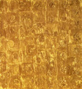
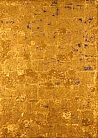
Yves Klein & Jean Tinguely: From the Exhibition:
|
|
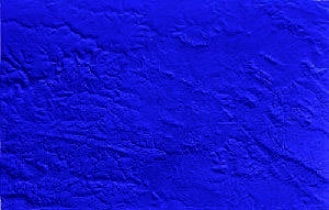
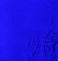
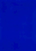
IKB (Godet), 1958 |
IKB 162, 1958 |
|
|
IKB 79, 1959 |
Exhibition Galerie Schirner, Frankfurt, 2004 |
|
|
IKB 86, 1959 |
IKB 66, 1961 |
|
|
||
Student Projects
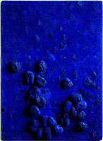
Wikipedia has an
entry for International Klein Blue which specifies RGB
values etc., but the colour displayed there is much too subdued.
(I last looked on December 1, 2005, employing a Sony 200 ES Trinitron
screen with default Macintosh display settings.) The discussion
about the entry reveals that the authors themselves are not completely
sure either.
There is a persistent rumour that Klein patented International Klein Blue, but this is false. Weitemeier (2002, p. 17) displays an image which she describes as the patent, but it is merely an envelope. Riout (2006, pp. 62-65) explains that Klein submitted a simple registration which does not convey any exclusive rights (an "enveloppe Soleau") – and that this registration did not concern the method to achieve the IKB color, but the material used to fixate the pigment onto the canvas.
|
|
|
||
|
|
|
|
|
|
|
|
1962 |
|
||
|
1960 |
|
|
|
||
|
|
||
|
|
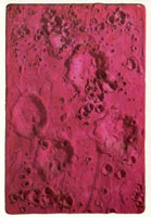
Relief Planétaire 2 (Grenoble 41) |
|
|
|
|
-1955-S.jpg)

-57-S.jpg)

-1957-S.jpg)

1958.jpg)


1960-S.jpg)
-1960-S.jpg)

-1960-S.jpg)